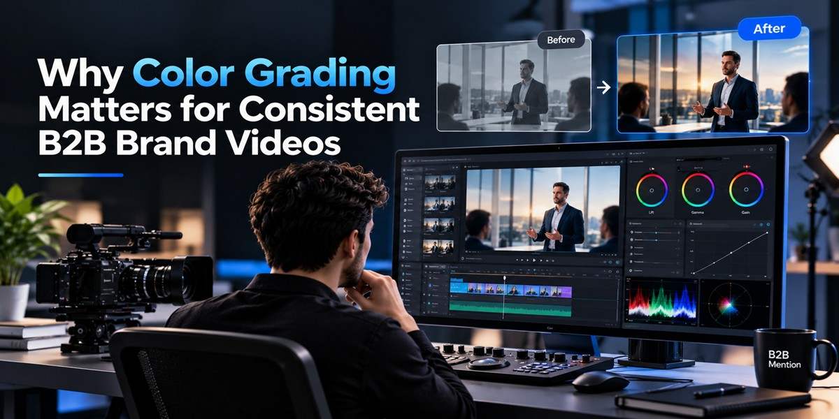

TL;DR: Consistent video branding is about more than logos, fonts, and colors in your graphics. The footage itself needs a steady visual look. Color grading helps balance different shots, reinforce a brand mood, and make videos feel like they belong together. For B2B teams producing demos, explainers, webinars, and social content, a repeatable color workflow can make every video feel more connected.
Introduction
Have you ever watched two videos from the same company and wondered why one feels polished while the other looks completely different? The logo may be the same, but changes in lighting, skin tones, exposure, and color can make the videos feel like they came from different brands.
This is where color grading becomes useful. It isn’t only a creative step for films or commercials. For B2B teams, it can help create a more consistent visual identity across product demos, customer stories, webinars, sales videos, and social clips.
Video is already a major part of business marketing. Wyzowl’s 2026 research found that 91% of businesses surveyed use video as a marketing tool, while 69% of video marketers said they created social media videos.
As teams produce more video in-house, consistency becomes harder to maintain. Different cameras, rooms, lighting setups, editors, and deadlines can all affect the final look.
This guide explains why color matters, how to build a repeatable workflow, common mistakes to avoid, and how modern editing tools can make the process easier.
What does color grading do for brand consistency?
Color grading creates a shared visual look across video footage. It can correct differences between shots and then shape the overall mood of the video. For B2B brands, this helps footage from different locations, cameras, or recording sessions feel like part of the same visual system.
Think about a software company that records product demos in an office, interviews customers remotely, and films employees at events. Each setting can produce very different footage.
One room may have warm lighting. Another may have cool fluorescent lights. A webcam might produce flat colors, while a professional camera captures much more detail.
Color grading helps bring these shots closer together.
It usually comes after basic color correction. Color correction focuses on making footage balanced, such as fixing exposure or an unwanted color cast. Color grading then gives the footage a deliberate visual style.
A simple brand look might include:
- Slightly warm skin tones
- Controlled contrast
- Consistent brightness
- A restrained color palette
- Similar treatment for different types of footage
The goal isn’t to make every video look dramatic. The goal is to make the visual treatment predictable enough that viewers recognize the brand.
Why do different video shots look inconsistent?
Different cameras, lighting conditions, locations, and recording settings can create visible differences between shots. Even when the content is strong, changes in exposure, white balance, contrast, or saturation can make a sequence feel disconnected.
Imagine a customer testimonial that cuts between three speakers.
The first speaker is filmed beside a window. The second uses an office webcam. The third records in a meeting room under overhead lights.
Without correction, their skin tones and background colors may shift noticeably. A viewer might not consciously identify the problem, but the video can still feel less cohesive.
Common causes include:
Different lighting
Natural daylight changes throughout the day. Indoor lights can also have different color temperatures.
Different cameras
Phone cameras, webcams, DSLRs, and cinema cameras don’t capture color in exactly the same way.
Different exposure
One shot may be bright and another may be darker. Matching them helps create smoother transitions.
Different editing sessions
When several people work on videos independently, each editor may make different choices about contrast and saturation.
A consistent color grading workflow gives the team a shared reference point.
Build a simple B2B color workflow
A repeatable workflow is more useful than trying to create a unique look for every video. Start with correction, establish a reference look, then apply the same principles across the project.
1. Correct before creating a style
Check exposure, white balance, contrast, and obvious color casts first.
Don’t try to create a cinematic look before the footage is balanced. If the foundation is inconsistent, creative grading won’t solve the underlying problem.
2. Pick reference footage
Choose one or two representative shots that show how the brand should look.
For example, a B2B company could use a well-lit employee interview as its reference. Other interviews can then be adjusted toward that appearance.
3. Protect important brand colors
Pay special attention to products, logos, clothing, and interface elements.
If a company’s primary blue suddenly looks purple in one video, the inconsistency can be distracting.
4. Compare shots side by side
Don’t judge each clip in isolation. Play neighboring shots together and look for sudden changes.
Faces, neutral objects, backgrounds, and important product colors are useful comparison points.
5. Save reusable settings
A repeatable grade can become a starting point for future videos. It still needs adjustment because different footage will have different lighting and exposure.
Modern editors can support this process with reusable grades, LUTs, curves, and other controls.
How can teams use color grading at scale?
Teams can scale color grading by creating a simple visual standard, using reference footage, reusing appropriate adjustments, and reviewing important shots before publishing. The process works best when the brand defines a few clear rules instead of requiring every video to have an identical look.
A useful B2B video color guide might define:
- Preferred warmth or coolness
- General contrast level
- Skin tone expectations
- Saturation range
- Treatment for product footage
- How logos and brand colors should appear
- Examples of approved footage
This guide doesn’t need to be complicated.
A marketing team could keep a small library of approved reference frames and use them when producing new content. That gives internal editors, freelancers, and agencies a common visual target.
This matters even more when a company publishes frequently. Wyzowl’s 2026 survey found that 59% of respondents create video entirely in-house, while another 32% use a mix of internal and external production.
When multiple people contribute to production, shared standards can reduce visual variation.
Where does AI fit into color grading?
AI can reduce repetitive editing work, but it shouldn’t replace the editor’s visual judgment. A useful AI-assisted workflow lets the editor describe a desired treatment, review the result, and make manual changes when needed.
This is part of a broader move toward editors working with AI inside the timeline instead of treating AI as a separate generation step.
For example, the AI-assisted editing workflow in invideo editor allows users to direct an editing agent while keeping the resulting edits on a multitrack timeline.
The same idea can apply to color work.
Invideo editor’s color workspace includes controls for exposure, contrast, temperature, tint, saturation, color wheels, curves, qualifiers, masks, LUTs, and professional scopes. It also supports using a reference image to guide a look.
For example, an editor might ask for a warmer look on a particular sequence, review the result, and then refine it manually. The important part is that the human editor still decides whether the result fits the brand.
This approach is especially useful when teams need to make several versions of similar content.
Common color grading mistakes to avoid
A consistent brand look doesn’t mean pushing every setting as far as possible. Subtle changes often work better for business content.
Avoid these common mistakes:
Over-saturating footage: Strong colors can make products, skin tones, and backgrounds look unnatural.
Using one LUT without checking every shot: A preset can be a useful starting point, but footage recorded under different lighting may still need individual corrections.
Ignoring skin tones: People are often the focus of B2B videos. Unnatural skin color can quickly make footage look distracting.
Matching numbers instead of appearance: Two clips can have the same slider values and still look different because their original footage is different.
Changing the brand look too often: If every campaign has a completely different visual treatment, it becomes harder to build a recognizable video identity.
Grading without checking the full sequence: A single attractive shot isn’t enough. Transitions between shots matter just as much.
A practical workflow with Invideo editor
For teams that want editing and color work in the same browser-based workspace, Invideo editor offers a multitrack timeline alongside AI-assisted editing and color controls.
A practical workflow could look like this:
- Upload the raw footage and organize the clips.
- Build the basic sequence on the timeline.
- Correct exposure and color balance.
- Choose a reference look for the project.
- Apply the visual treatment across similar shots.
- Compare faces, products, and backgrounds between clips.
- Make manual refinements where footage differs.
- Review the entire sequence before exporting.
The platform also lets users work with AI agents on the same timeline while retaining manual control over the edit.
For teams producing several types of content, this can help keep repetitive editing tasks within one workflow. The important part is still the review stage. AI can assist with adjustments, but people need to decide whether the final footage communicates the intended brand style.
Conclusion
Color grading is easy to overlook when a B2B team is focused on scripts, messaging, and publishing schedules. But visual consistency can make a collection of videos feel much more connected.
Start with a few practical rules. Correct footage before adding a creative look, keep reference examples, protect important brand colors, and review shots together rather than separately.
For teams producing content at scale, tools such as Invideo editor can bring timeline editing, AI assistance, and detailed color controls into the same workflow.
If you’re building a repeatable video process, create a simple color reference and test it across several real projects. From there, you can refine the look based on what works for your audience and content.
What visual elements do you think are most important for keeping a B2B video brand consistent?
FAQs:
What is color grading in video?
Color grading is the process of shaping the color, contrast, and overall visual appearance of video footage. It can be used after basic color correction to create a specific mood or visual style. In B2B content, it can also help footage from different cameras and locations feel more consistent.
Is color grading the same as color correction?
No. Color correction usually focuses on making footage balanced and accurate. This can include fixing exposure, white balance, and unwanted color casts. Color grading comes after or alongside correction and focuses more on the creative appearance of the footage, such as its warmth, contrast, and overall tone.
Why does color consistency matter for B2B videos?
Consistent color helps different videos feel connected. This is useful when a company publishes product demos, interviews, webinars, customer stories, and social clips created in different locations. A shared visual treatment can make these different formats feel like parts of the same brand system.
Should every B2B video have the exact same color grade?
Not necessarily. A training video, customer interview, and event recap may need different visual treatments. The goal is to keep core elements consistent while allowing enough flexibility for the subject, location, lighting, and audience.
Can AI help with color grading?
Yes. AI-assisted editing can help with repetitive adjustments or apply a requested visual treatment, depending on the editing software. Invideo editor, for example, lets users direct an AI agent while also providing manual color controls. Human review remains important because the editor needs to judge whether the result fits the footage and brand.
What should I check before publishing a graded video?
Watch the complete video instead of checking individual shots only. Look for sudden changes in brightness, skin tone, saturation, and important product colors. Also check transitions between cameras and locations. If possible, review the video on more than one screen before publishing.